Data Visualisation has become an increasingly popular way to make complex data accessible to the masses, but do we need to rethink our scientific approach to data storytelling? Making data not just understandable, but truly felt, could allow us to enable
deeper connections between data and people—paving the way for more meaningful, empathetic decision-making.
Effective data storytelling requires an additional dimension.
Data Visceralisation (DVx) is an innovative approach to data storytelling which places greater importance on both the experience conjured by the data, and the experience of the human behind the data.
When communicating insights drawn from data, organisations often look to be as objective as possible and can lose the meaning and human stories that are not adequately expressed by simple charts and KPIs. It is important to show “responsible”
Data Visualisations that have context and tell the full story – but we shouldn’t shy away from including a human element illustrating lived experience, to our insights and solutions.
DVx goes beyond just the standard graphical elements we are used to, seeking to create a more profound, immersive, and intuitive connection between end-users and the data in question. It is about not just the visual element but engaging and drawing on
our other senses and emotions to generate a deeper understanding of a subject and create a more lasting impact for viewers in some way. We can use this as a tool to not just see and analyse data but feel and experience it.
In Fig.1 and Fig 2 below we can see two different approaches to visualising the same, or similar data, showing US gun deaths in a given year. Fig.1 takes a DVx approach, using average life expectancy statistics to demonstrate the years lost due to gun
deaths in an attempt to convey the gravity of the situation and the individual human life lost behind each number. Fig.2 takes a much more standard Data Visualisation approach, showing clearly and objectively in bar chart format how many gun deaths
occurred each year. The data visualised is the same, but the lived experience is represented more purposefully in Fig.1.
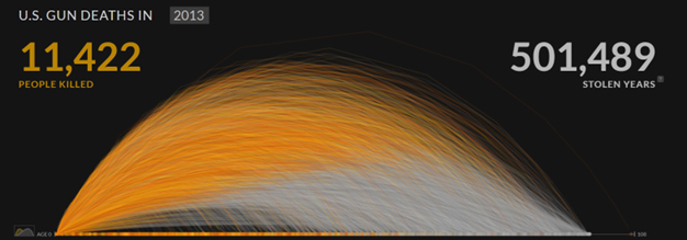
Figure 1: Gun deaths visualisation by Periscopic (https://guns.periscopic.com/?year=2013)
Figure 2: Gun deaths visualisation by Statista (https://www.statista.com/statistics/258913/number-of-firearm-deaths-in-the-united-states/)
DVx stems from the Data Feminism approach to handling data, which, “teaches us to value multiple forms of knowledge, including the knowledge that comes from people as living, feeling bodies in the world” (D’Ignazio & Klein, 2020).
As we continually seek to glean more from our data, does it not stand to reason that we should look for ways to include the human experience to supplement the numbers and metrics?
As the meteoric shift towards AI encourages us all to consider the human experience in a new way, we seek to argue that our methods of reporting and visualising data need to be expanded to give a more holistic, human-centric experience for users.
Why should we be using it?
Data isn't always as neutral as it seems. When we present data, we are always telling a story (and, by extension, not telling other stories which could be told). Different ways of presenting the same data can tell very different stories, influencing how
people interpret and act on the information. Acknowledging this encourages us to work towards creating visualisations that capture the true implications of the data.
At Sopra Steria Next we are human-focused and are guided by the users of the services we create. Methodologies like DVx that increase connection between people and enabling technologies are key to our “the world is how we shape it” ethos.
Looking at personas specifically, some examples that we have seen in our work that bring this to life are:
- An Accommodation Booking Officer in the Armed Forces may be assisted in more effectively assigning lodgings by being able to infer more nuanced information around the needs of the individual, their circumstances and their lived experience beyond seeing them as simply a number in a spreadsheet.
- A Recruiter may want to be more successfully nurture candidates through a recruitment pipeline and can use DVx approaches to create a more meaningful, tailored connection with the candidate and better understand their experience and motivations on a human level. This can then allow the Recruiter to more accurately guide, mentor and coach the candidate in their recruitment journey to increase their chances of success.
DVx can help us here by enhancing the narrative around a particular data point and enabling more informed decision making. This allows the user makes a more human connection with the data they are interacting with.
The opportunities to bring data-driven stories to life are endless when we add a new dimension to traditional Data Visualisation solutions. As a a human-centred Consultancy, we believe success starts with putting people first- especially when looking
at the world through a data lens. That’s why we’re excited to bring DVx into our work, a concept designed to tell human stories more effectively with data and make it truly come to life.
So how can we ensure ethical practice?
We do have to ask the question - how much should we be using data to influence users, and how can we maintain an ethical way of working?
As with any data practice it is critical to keep Data Ethics principles in mind throughout the process., In order to maintain integrity when utilising DVx methodology some principles which are important to consider are:
- Safety – will the impact of the visualisation cause harm to any users’ wellbeing or psychological safety? If so, how can we mitigate this, or what resources can we offer to support them?
- Transparency – is the source data available and understandable? Is the process that has been used to derive the visualisations transparent and open to review?
- Relevance – is the data being presented relevant to the point being made?
- Accessibility and Inclusion – are the visualisations compatible with assistive technology? Is the language used accessible?
- Honesty – are we telling the story that we and others genuinely see in the data, and is this the main story?
- Discrimination – Can we justify why we have chosen to present the data we have (and why not the data we have left out)? Have we considered how conscious or unconscious bias may impact the output?
It is, of course, extremely important to be accurate and interpretable when creating any form of data reporting or visualisation. We must first and foremost consider the needs of the audience, and this principle still stands regardless of the approach
used.
What does it mean for me?
Embedding the concepts of DVx into our ways of working has massive potential for both organisations and end users. By making data more engaging and easier to connect with on an emotional level, we can transform the way users interact with information.
This approach goes beyond just presenting numbers and charts - it makes the data feel more alive and relevant to the users.
In conclusion
As traditional Data Visualisation and storytelling techniques reach a plateau, DVx offers a compelling new direction for enhancing how we engage with data. DVx pushes us to move beyond purely visual representation, inviting us to experience data in new
and more tangible ways. This approach focuses on creating embodied, sensory experiences, making data more accessible and emotionally resonant. Rather than relying solely on static charts or graphs, visceralisation brings data to life in ways that
evoke empathy and deeper understanding.
By connecting with our senses, DVx can transform the way people relate to and interpret information. For instance, turning data into sound or physical objects not only makes data more engaging but also more inclusive, enabling broader accessibility for
diverse audiences. These sensory experiences can spark emotional responses, making data-driven insights more impactful, memorable, and actionable.At Sopra Steria Next, we believe that the future of data representation lies in this human-centred approach.
To elevate the human story behind the data or add an additional dimension to the user experience by evoking emotion in some way – we must look for ways to draw on the human experience around data to take our visualisations to the next level.
The landscape around Data Visualisation is evolving, and embracing more visceral, multi-sensory methods can unlock new layers of insight and meaning. Whether we’re augmenting traditional visualisations or creating entirely new ways to experience
data, we aim to help organisations get the most value from their data by focusing on the user experience. At Sopra Steria Next, we believe the landscape around Data Visualisation is changing and we can help you get the most value possible out of your
data by enhancing the experience for users.
If you would like to discuss more about how our approach could help you, speak to: Susannah Matschke, Millie Waters, Dan Jenkins